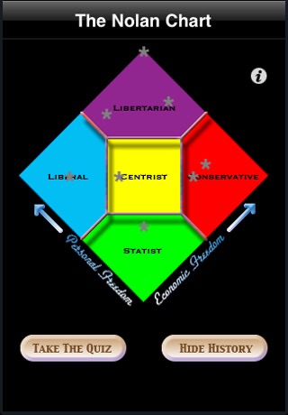
Nolan Chart app for iPhone and iPad
Developer: Anywise Enterprise, LLC
First release : 17 Oct 2008
App size: 552.36 Kb
*** I wrote this app as practice while I was learning to code and offer it as a free app (with no advertising) as a way of saying thank you to all those who have purchased my other app, Gym Buddy. Thank you! ***
The Nolan Chart was popularized by David Nolan in 1971 to illustrate that the typical left-wing/right-wing view of politics is only half the story.
The simplest way to accurately model a political viewpoint is to consider both personal and economic issues, which yields a two-dimensional graph, not a straight line.
Once you start thinking in this paradigm, it can change your perspective forever.
The Nolan Chart is a great tool to get people to start thinking differently.
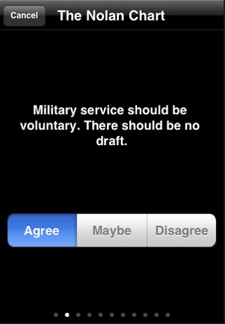
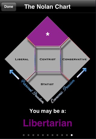
Hand this to your friends, they agree, disagree or answer ‘maybe’ to 10 political statements, and at the end they are presented with their political viewpoint -- which is graphed onto the chart.
Touching an ideology on the chart brings up a short description of that ideology.
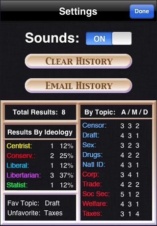
Nolan Chart keeps track of the answers given and the resulting ideology, and allows you to email these results.
